Modifying plots
The default plot in R is not too bad (better than Excel, at least!), but does require some modification for presentation and publication.
We will illustrate the various ways to modify default plots with the simple bird data set.
BirdData <- data.frame(
            Tarsus  = c(22.3, 19.7, 20.8, 20.3, 20.8, 21.5, 20.6, 21.5),
            Head    = c(31.2, 30.4, 30.6, 30.3, 30.3, 30.8, 32.5, 31.6),
            Weight  = c(9.5, 13.8, 14.8, 15.2, 15.5, 15.6, 15.6, 15.7),
            Wingcrd = c(59, 55, 53.5, 55, 52.5, 57.5, 53, 55),
            Species = c('A', 'A', 'A', 'A', 'A',  'B', 'B', 'B')
            )
1. Modify all the plots or just one?
There are two ways to set graphical parameters.
i. For all the plots
Graphical parameters are arguments of the function par().
Usually we call par() to set the parameters that apply to subsequent calls to plot().
par()  # set the graphical parameters
plot() # make a plot
plot() # make another plot with the same parameters
You should also spend some time exploring the help page of par(), there are many more options and details than covered here.
ii. For each plot in turn
All plotting functions (plot(), hist(), etc) have the argument , ... .
This argument allows us to include other arguments within the call to plot().
So, we can include arguments of par() within the plot() function. These parameters will then only apply to that plot.
We will use this method below.
2. How to make different kinds of plots
Use plot() to make a scatter or line plot
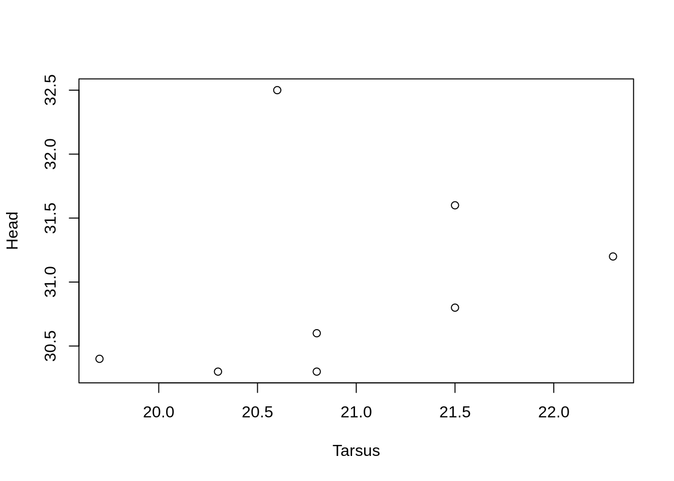
The default figure if we use plot() with two continuous variables is a scatter plot.
plot(Head ~ Tarsus, data = BirdData)
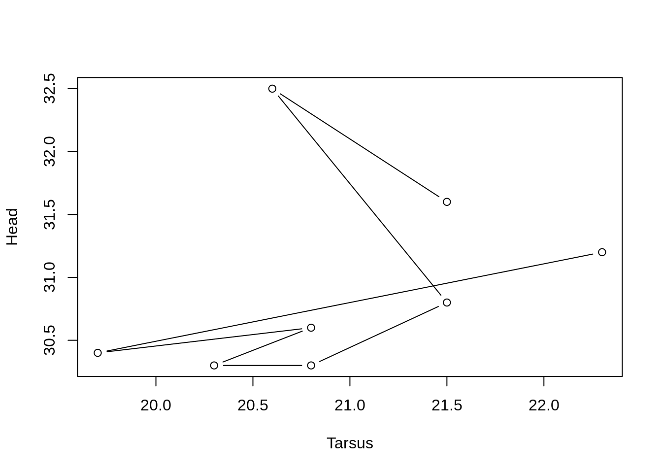
We can use the argument type = 'l' to convert this to a line plot. (type = is an argument of plot()).
plot(Head ~ Tarsus, data = BirdData, type = 'l')

Or points and lines, with type = 'b'
plot(Head ~ Tarsus, data = BirdData, type = 'b')
3. How to modify the axes
R tries to make the axes look as nice as possible, with sensible gaps between the tick marks, and ranges, etc.
However, in many cases you may want to change these.
Axis limits
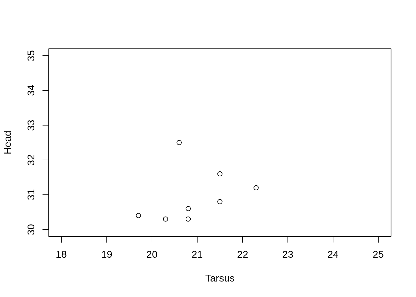
To set new axis limits, pass a two element vector of the minimum and maximum to xlim = and/or ylim = .
plot(Head ~ Tarsus, data = BirdData,
     xlim = c(18, 25),
     ylim = c(30, 35)
    )
Axis labels
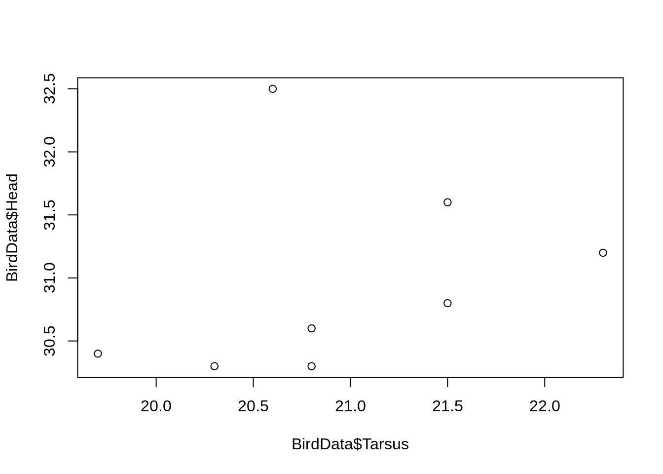
R passes the names of the data arguments used in plot() as the axis labels.
With no data = argument, the full text including the dataframe name, is used.
plot(BirdData$Head ~ BirdData$Tarsus)
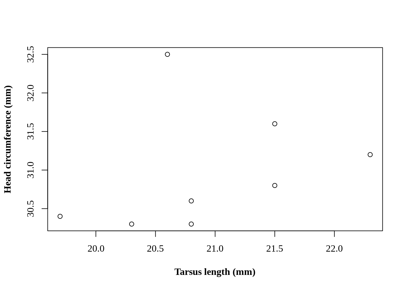
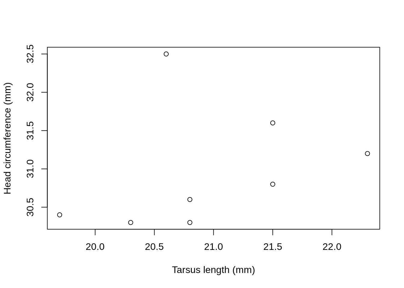
We can specify the exact labels as text strings with the arguments xlab = and ylab = .
plot(Head ~ Tarsus, data = BirdData,
     xlab = 'Tarsus length (mm)',
     ylab = 'Head circumference (mm)'
    )
Axis tick marks
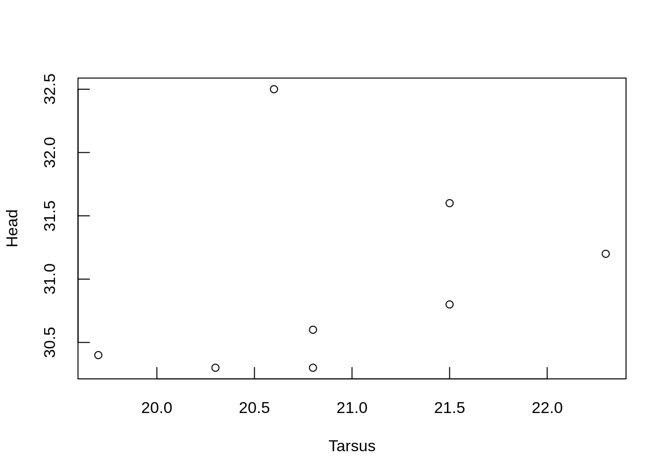
The default is tick marks extending out from the axes (tcl = -0.5).
Length is specified as the fraction of the height of a line of text.
To have tick marks extend inwards, remove the - sign.
plot(Head ~ Tarsus, data = BirdData,
     tcl = 0.6)
Axis text orientation
The default is to plot the text and tick mark labels parallel to each axis.
Set las = 1 to make them always horizontal.
plot(Head ~ Tarsus, data = BirdData,
     las = 0)

Suppress axes
Some times we want to have different labels on the tick marks, or add axes to other sides of the plot.
First, we need to supress the plotting of the default axes.
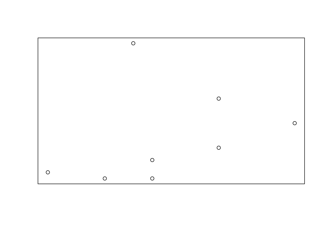
plot(Head ~ Tarsus, data = BirdData,
     xaxt = 'n',
     yaxt = 'n')
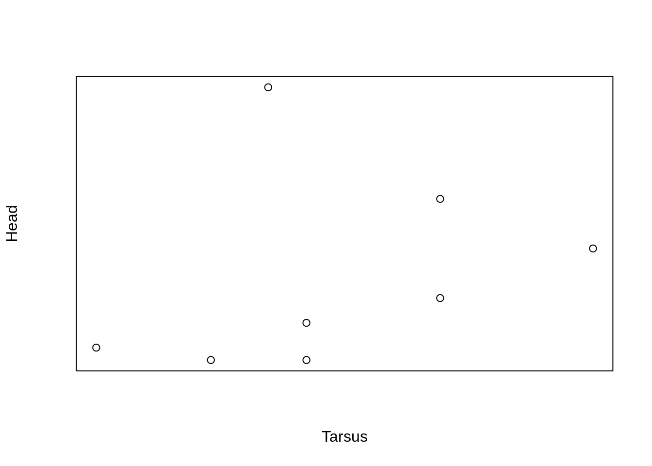
Notice that the labels are still plotted.
To ‘remove’ the axis labels, we can pass an empty text string to xlab = and ylab = .
plot(Head ~ Tarsus, data = BirdData,
     xaxt = 'n',
     yaxt = 'n',
     xlab = '',
     ylab = '')
Add an axis
To add an axis, we need a new function, axis().
This is covered in Adding to Plots
4. How to modify lines and symbols
Specify symbol type
We can choose from a variety of different symbols, or plotting characters, using e.g., pch = 0.
plot(Head ~ Tarsus, data = BirdData,
     pch = 0
    )

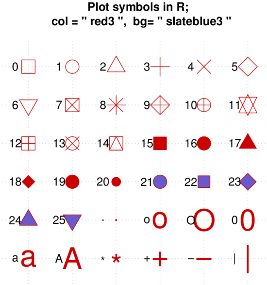
Fig. The range of characters in R. Source.
Specify line type
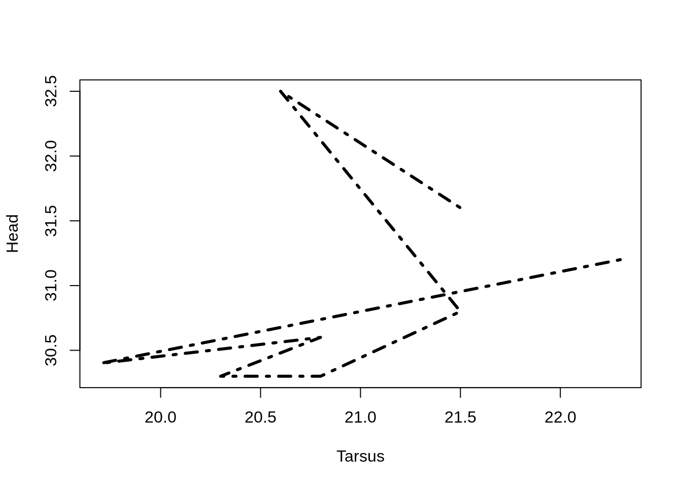
Line type (solid, dashed, etc.) can be altered with the lty = argument:
0 = blank, 1 = solid (default), 2 = dashed, 3 = dotted, 4 = dotdash, 5 = longdash, 6 = twodash.
Line width can be altered with lwd = .
plot(Head ~ Tarsus, data = BirdData,
     type = 'l',
     lty = 4,
     lwd = 3
    )
5. How to modify size
In many cases, the size of text, points, and labels is too small.
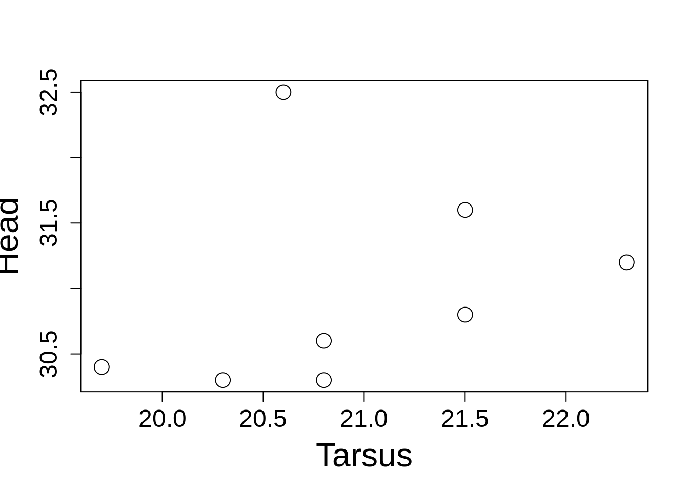
The size of almost anything in a plot can be altered using cex = , a number giving the magnification relative to the default. The default changes depending on the layout of the plotting area, but starts as 1.
Size of data points is changed using cex = .
Size of text is changed using cex.lab = and cex.main = .
Size of the axes elements is changed using cex.axis = .
plot(Head ~ Tarsus, data = BirdData,
     cex = 2,
     cex.lab = 2,
     cex.axis = 1.5
    )
6. Basics of colour
For publication in print, most often you will use shades of grey, but R has access to a wide range of colours.
Color for the data points or lines can be accessed via the argument col = 1:
- number (e.g.,
col = 2), - name (e.g.,
col = 'red'), - hexadecimal (e.g.,
col = '#FF0000'), - or even an RBG value.
plot(Head ~ Tarsus, data = BirdData,
     col = 'blue', pch = 19
    )
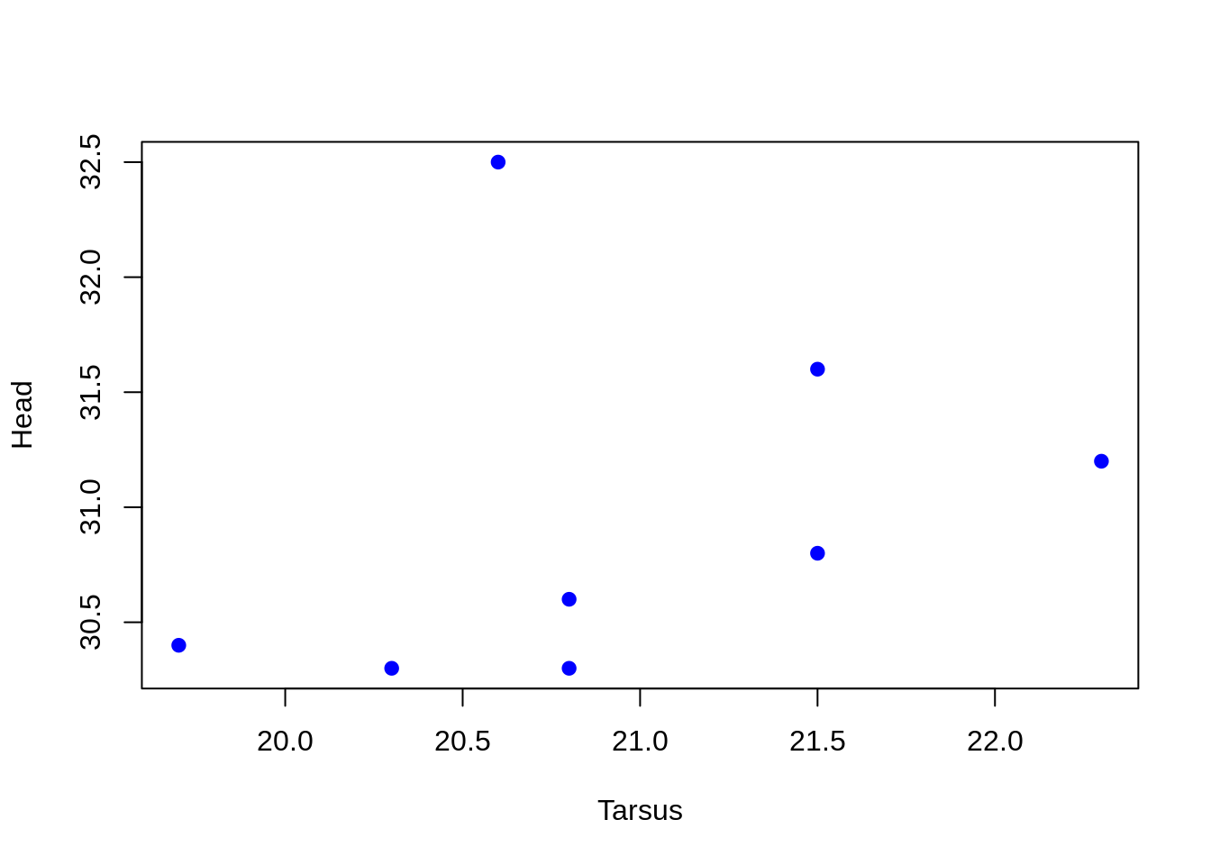
You can use col.lab = , col.main = , and col.axis = to change the colour of these external parts of the plot, if needed.
Using vectors to set colours
We can set colour using a vector as well.
plot(Head ~ Tarsus, data = BirdData,
     col = 1:8, pch = 19
    )
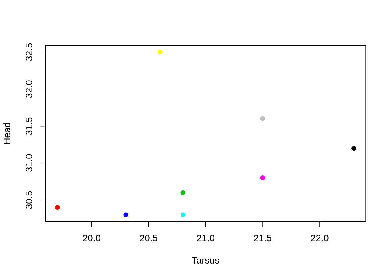
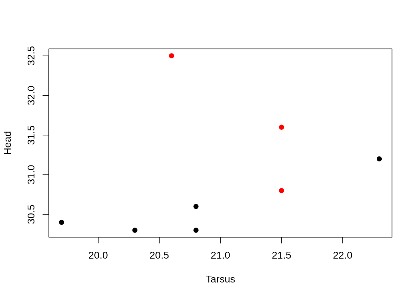
Or use a column from the data. (Here, R takes the factor column $Species, and uses the factor levels (1, 2) to carry across to the colour numbers.
plot(Head ~ Tarsus, data = BirdData,
     col = Species, pch = 19
    )
7. How to change the font
Many journals require specific fonts.
Fonts in R (and other software) are tricky, because each graphics device (e.g., pdf, png, …) has its own default fonts and system of dealing with fonts. Further, font can be specified in several different ways, and there is no universal system of naming or calling fonts in computer operating systems. See here for those who are interested.
However, there are some straightforward things we can do easily.
Font style
You can use font = to specify whether the font is:
-
plain (
font = 1, default), -
bold (2),
-
italic (3), or
-
bold italic (4).
Use font.axis = , font.lab = , font.main = , font.sub = to set fonts for each respective piece of text.
Font family
In many graphics devices, you can also specify the family:
-
family = 'serif'(serif, often Times New Roman), -
family = 'sans'(sans-serif, often Helvetica), -
family = 'mono'(monotype, often Courier))
plot(Head ~ Tarsus, data = BirdData,
     xlab = 'Tarsus length (mm)',
     ylab = 'Head circumference (mm)',
     font.lab = 2, family = 'serif'
    )
